
 ME!
ME!
 链滴
链滴
在设计和编程之间只有薄薄的一线,当我们进入新的十年时,这条线变得越来越模糊。在Photoshop上绘制漂亮的模型就够了吗?5年以前也许如 此。在今天,普通的网络用户要求的更多。所有的东西都很漂亮,但没有实质内容,过段时间人们就会厌烦。如果你唯一的目标是用你漂亮的设计影响圈内其他设计 师,你会发现你很快就落伍了。2011年不关心漂亮,而是关心功能。新的一年甚至十年的趋势是交互设计、粘度和虚拟现实。
2011年你会如何设计呢?设计师的最终目标是留住用户,而不是让人炫目。所有得到惊讶声和赞叹声的设计师都很容易被忘记。高超的设计师可以创 造出一种环境,吸引并迷住用户到不想点击"返回"按钮的地步。几个元素汇聚在一起,组成一个奇妙的幻境:和谐的色彩主题、直观的设计、易用的信息和快速的 反应。另外,永远不要低估简洁的力量。当然,情况一直如此,但在2011年,你将不再仅针对电脑桌面和笔记本,还要为智能手机、上网本、Tablet等等 设计。你准备好了吗?
看看2011年前11个趋势。
1、更多的CSS3+HTML5
多么令人满意啊!在过去几年里,CSS3和HTML5只出现在网页设计那遥远的地平线上。但现在,在2011年,我们看到了它的爆发。设计师们 终于开始让Flash走开。你可能感觉到,Flash和一些对你当前和潜在用户有用的最新最热技术,配合的不是很好。在2011年,你会慢慢远离 Flash,拥抱被称为HTML5的魔术。看看这组惊人相似的比较:


现在已经显示,Flash和HTML5是不相等的对手。在2011年两者都有大量的应用空间。问题是设计师们在2010年(和之前)滥用了 Flash。举一个例子,很少整个网站由Flash组成,特别是这些日子。HTML5减轻了Flash的一些负担。不过,HTML5还不能完全取代我们由 Flash实现的那些非凡的设计元素。
也许更让人兴奋的是,CSS3在今年可以投入使用了。移开Photoshop(哇,Adobe还是不能休息),CSS3可以更快实现文本阴影、圆角边框和背景透明。如果你还没有开始,现在就开始钻研了解CSS3和HTML5吧。
2、简洁的配色方案
简洁。没有什么比在安静的背景上显示清晰的消息更安静了。安静可以被解读为几种不同的方式。忘掉黑白和灰度阴影,想想绿色、黄色或甚至红色作为你的主色调。不过,限制你的调色板只有两或三种颜色,试试各种颜色不同的灰度。用少量颜色表现信息是非常了不起的。观察一下:

绿色阴影创造了这个Twitter可视的工具。边注:这个网站是用XHTML/CSS和Javascript创建的。

如果做的不好,红色很容易产生冲突。这个网站用高对比的易读文字克服了红色本来的特性。
3、适用于手机
智能手机、iPad、上网本,哦天哪!一个令人眼花缭乱的手机产量在2011年提供给消费者。这意味着你的网页设计必须适应多种窗口。
创建一个适用于手机的网站不是简单的从你的设计中去掉那些花哨的东西。这只会产生一个空虚无个性的设计。虽然不太可能,但从你的原始设计中去掉那些魔法,变成简单陈述你的品牌,这非常困难。幸运的是,技术正在快速解决这些麻烦。
借助CSS3的帮助,主要是media queries,手机网页设计有一个大的飞跃(以后详说)。最重要的一个进步是,你可以设计一个整站并允许你的编码遵从用户的可视区域。
设计一个专门的手机网站可能很有诱惑力,但这可能不再能满足你的观众了。越来越多的手机网站包含了访问原始网站的选项。如果你没有提供这一选项 或你的原始网站没有为手机标准优化好,你就没有为2011年做好准备。预测显示,智能手机今年的销量将超过个人电脑。准备好你的设计,满足这一需求。
4、视差滚动(Parallax Scrolling)
视差滚动:不是指老早的电子游戏。如上所述,2011年这一热门设计趋势是创造一种深度感。还有什么方法比视差滚动更好吗?视差可以影响用户产 生一种三维空间的错觉。它可以由一些简单的CSS技巧或jQuery插件如Spritely的帮助实现。视差滚动可以作为设计中最重要的次要元素,例如, 在页头、页脚,或背景。把它放在导航可能会迷惑你的访问者。

Old Pulteney Row to the Pole网站在背景中使用了由上至下的视差滚动效果。这增加了一种很微妙的深度和许多乐趣。
只由CSS和HTML创建的视差滚动,由Roman Cortes创建。
5、为触摸屏设计,而不是鼠标
技术已经越来越变得触觉化。可用性正从抽象转向具体。这意味着,不是操作你的鼠标去远程连接,你的目的地就在你的手指尖。Tablet、大多数智能手机和一些台式机都使用触摸屏。你的设计可以容纳用手指导航吗?
你的多少设计是以鼠标为导向的?作为设计师,我们尊敬鼠标。当鼠标悬停的时候,我们的链接正在发亮。然而在触摸屏中没有悬停这回事。你的设计如何向访问者显示链接呢?下拉菜单怎么办呢?在触摸屏设计中这也是不行的。
同样的,访问者将如何细读你的网站呢?有争议的是,网站可能是为标准网页浏览器创建的,而在触摸屏中,水平滚动可能更适合。很好的适应这一情形的是杂志一样的布局,访问者几乎可以翻阅你的网站。
最后,考虑一下,将流动布局作为交互设计义务的一部分。在2011年,你不再应付屏幕分辨率的大小。访问者会从垂直的浏览方向改变到水平的浏览方向。你的设计必须是灵活的,能适应任何挑战,否则你将停留在2010年。

婴儿在看iPad的魔术(版权属于Steve Paine,Flickr)。
6. Depth Perception in Web Design
No, we are not dealing with the aerial ‘I can see your coffee cup and keyboard on your website’ design of two years ago. Depth perception is about creating dimension in your web design, so that parts of your site looks nearer than others. It conjures a faux 3D effect when done masterfully. Remember what it felt like watching the blockbuster 3D movie, Avatar? The elements jumped off of the screen, quite literally.
Although 3D technology has no yet made it to web design, you can still replicate depth in your design.
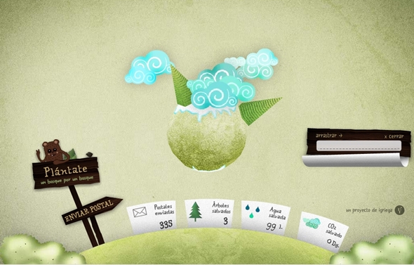
This playful website features a rotatable, 3D planet and makes use of depth with well-placed shadows and layering.
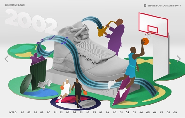
Eye-catching and smart, this celebration of Jordan (both the man and shoe) is thoroughly entertaining. The 3D elements are crisp and simple, which what makes them so stunning.
7. Large Photographic Backgrounds
Large scale backdrops will surge in 2011. These images will be high resolution, and covering the entire site. Large photos are an instant way to grab your audience– they cannot help but to see it and have an opinion about it. The background photo must be content-appropriate. Simply having a pretty image in the background without any context will disrupt your user’s experience. Trends point to soft and slightly transparent imagery that does not over shadow your content, but harmonizes with it.
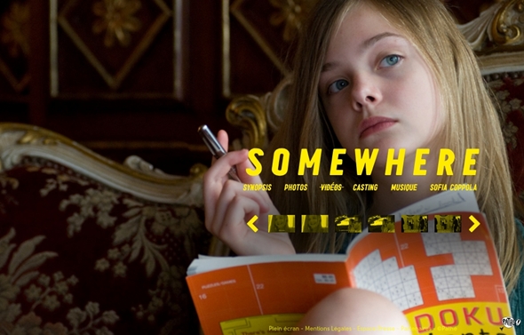
This site makes use of high-resolution photos and the predominant color is yellow throughout.
This site adds playful animation with its grand scale imagery. Warning: auto-play music.
8. Adventurous Domain Names & Integration
Although not in the strictest sense a web design issue, look forward to seeing more creative domain names. The once-coveted .com domain has lost a lot of its appeal– primarily because you have to think up words in Na’Vi in order to find a domain that has not been thought up yet. 2011 will see a more wide-spread venture away from .com and into more whimsical domains like .me or .us. Think of the possibilities and scoop it up before it’s gone.
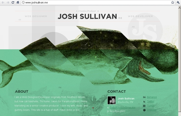
.me is a great domain to use for personal portfolios, or blogs, especially if you want a seperate identity from your corporate brand.
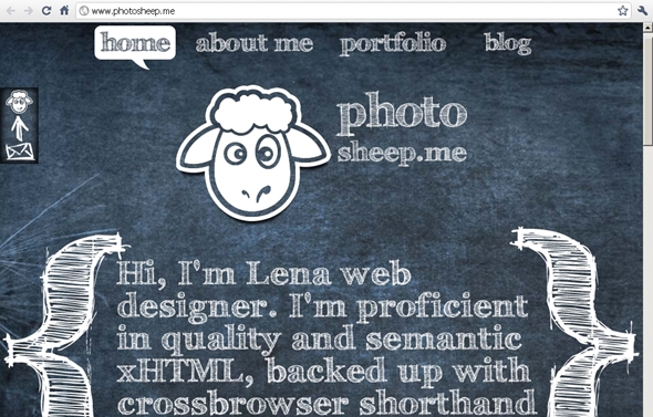
Another example of .me integration.
9. QR: Quick Response
If you have noticed those square barcodes popping on business cards, magazines or else where, you may already know that they are a hot trend for 2011. How exactly does it translate into web design? Amazingly well, in fact.
The barcodes are called QR, short for Quick Response. Simply take a photo of the unique barcode with your camera phone. Like magic, your phone will call up the website associated with said barcode. The beautiful thing about QR is that you can use it in a myriad of ways. Feature your QR on your website, in order for site visitors to have a shortcut to your mobile site. You can also track your visitors through QR, by placing a special referral code on your URL. When you are leaving comments on sites such as this, use the QR as your avatar.
2011 is all about mobility and it will be smart to take advantage of this new medium.
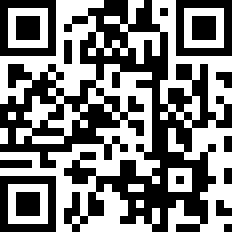
This is the QR for the author’s personal website. Create your own code here.
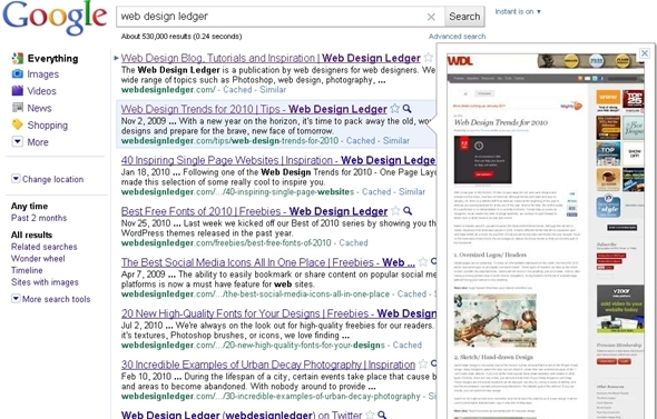
10. Thumbnail Design
The ever-enterprising folks at Google have introduced the average user to thumbnail browsing. Gone are the days of clicking through to see the content of a website. These days, you just click on the magnifying glass and hover (assuming you’re not on a touchscreen). Magically before you is a glimpse of what waits on the other side of your click.
If your design is Flash-based, that is definitely going to be a problem. The preview will not display those elements of your design.
As the average internet user becomes more surfing-savvy in 2011, expect to see more people navigating by these means. It is just too great of a temptation not to judge a site by its thumbnail.
11. Constant Connection/ Life Stream
Last, but certainly not least, is the focus on constant connection in web design. The internet is, by nature, a sterile environment, and we make it human by sharing our lives in an open forum. Expect to see more intimacy through the form of lifestreaming. Personal blogs and portfolios in 2011 will prominently feature live Twitter feeds (not just a link to the Twitter page). People will let you know where they are at any moment of the day via Foursquare. In fact, expect to see a dedicated lifestream for all of one’s online activity. 2011 will definitely bring out our inner, creepy stalker, no doubt about it.
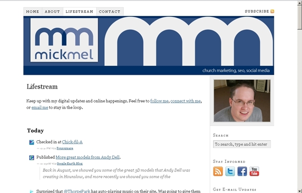
A personal site that utilizes lifestreaming.
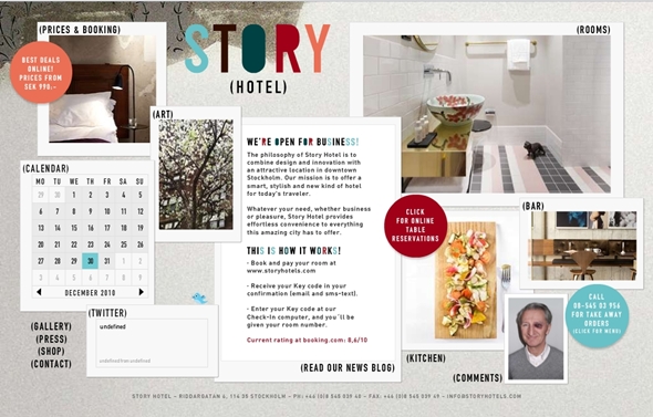
This is a business site that synthesizes a lot of information on one page.
Posted by Jacqueline Thomas on Jan 4, 2011 http://webdesignledger.com/tips/web-design-trends-in-2011